Hello! Sherry Cheever here again with my final post as Guest Designer. First, I want to say how much I’ve enjoyed being here with you and in particular want to thank Jennie for asking me to be a guest designer! It’s been a blast!
My project today is a stampy one. I’ve recently felt the need to get back to my stamping roots and wanted to finish up here with a project that included mostly stamps.
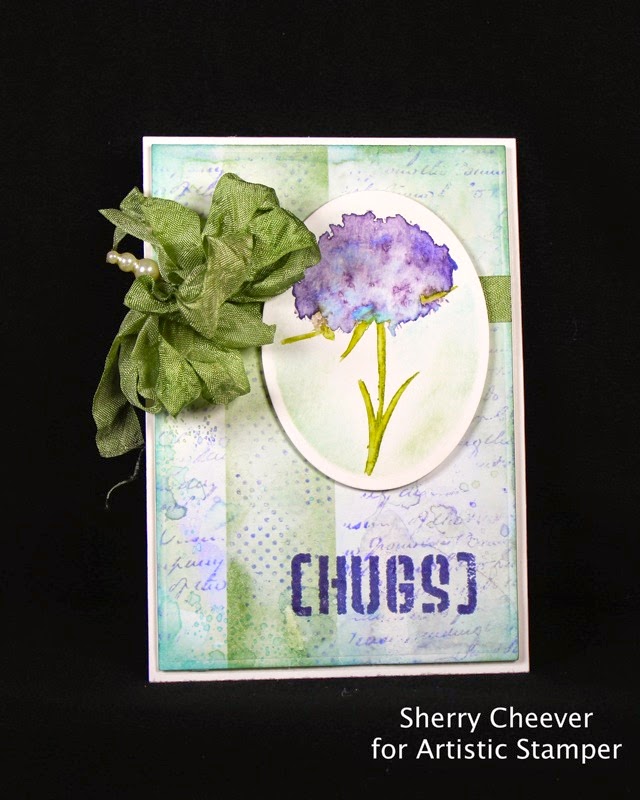
The first step for me in assembling this card, was the flower image. Actually, I had a different vision when I started and once I stamped the flower I couldn’t make myself do it. I liked it so well, that I couldn’t mess it up and decided to die cut the image with an oval die template.
The flower is one of the images from Botanical Plate 1. The image was colored with Peeled Paint and Dusty Concord Distress Markers, misted with water and then stamped on watercolor paper. Using a water brush, the ink was colored in and touches of blue were added to the flower with Tumbled Glass. While the image was still in the die template, the edges were sponged with Bundled Sage and Tumbled Glass Distress Inks.
The background for the card was made with the Wrinkle-Free Distress Technique and water color paper. Colors used for the background were Bundled Sage, Shaded Lilac and Tumbled Glass Distress Inks.
Once the background was dry, painters tape was used to mask off a line down the page.
Using the tiny dots from Mini Backgrounds 1, the image was stamped down the center with Shaded Lilac. While the tape was still in place, Bundled Sage was sponge over the stamped area.
The stamped line was then masked with painters tape
and the Calligraphic Mat 11 was stamped over the remaining background with Shaded Lilac.
“[Hugs]” from Grungy Greetings 1 was stamped at the bottom of the page in Hydrangea Archival Ink. (my daughter jokingly said it looked like chug . . . if so, tip one back for for this BAD girl!)
Bundled Sage was used to dye the seam binding ribbon, which was attached to the background layer before it was affixed with foam tape to the card base. The image was then mounted on the front with foam tape for more dimension.
Thanks for stopping by and joining me!
Wednesday, 28 May 2014
Monday, 26 May 2014
Capture Your Dreams by Astrid
Hi everyone and thanks for dropping in here.
Today I am sharing a project using some of the new stamps by Katie Leitch (formerly Fox).
I started with a long Prima tag I had in my stash. I cut off the bottom and then created a background with the help of some Tumbled Glass Distress Paint and Weathered Wood, Iced Spruce and Gathered Twigs Distress Inks.
Next I stamped the Jumbo Camellia size A6 straight onto the tag in Coffee Archival ink. I then stamped just the flowers, which come as separate stamps with this set, in Chipped Sapphire Distress Ink on white card, cut them out and glued them onto my main flower.
Now the other stamps I wanted to use are from the beautiful Flutterby set. The moment I saw these solid butterfly stamps, I thought, - great for "kiss stamping". If you don't know what kiss stamping is, - this is how it works: You ink your solid stamp, then stamp into the inked stamp with another un-inked stamp, and then stamp the original stamp onto your project. Whatever second stamp you used will appear in white on your stamped impression.
So I took three different butterflies, inked them with Chipped Sapphire, pressed a little text stamp (a really old Tim Holtz one) onto the inked butterflies and then stamped onto some white card. I cut them out and adhered them to my two part tag. Sometimes this works better than other times (see samples below):
I stamped the word Inspire from the Journaling Words 2 set in Coffee Archival along the side of the top part.
I also stamped a few faint impressions with the Calligraphic mat 12 in the background of both the top and the bottom and then finished my little tag hanger with some little chit chat stickers and a ribbon at the top. I fasted the two tags together with some rusty wire from my stash.
Well, hope you like it. If you have never tried "kiss stamping" before, give it a go, it is great fun to do.
Thank you for visiting and make sure to stay inky!!
Saturday, 24 May 2014
Can I interest you in...
Hello all, Alison (butterfly) here with a mischievous little trio of ATCs... each of them attempting to entice you into a purchase you didn't even know you wanted! I love these Artistic Stamper Steampunk stamps - they're like a little touch of time-travel, which regulars at Words and Pictures will know is something I yearn for.
There's the frankly malevolent-looking Phineas Pinchbeck, offering up his clocks to the satirically appropriate clients.
And for the proud possessors of Luxuriant Moustaches, you won't want to be without Professor Barber's patent pomade.
The ATCs themselves are pretty simple, as I think these advertising images pretty much sell themselves. I started with some ink on the craft mat - Pumice Stone, a hint of Vintage Photo and a few spritzes of Heirloom Gold Perfect Pearls spray, which adds a lovely metallic touch.
There's the frankly malevolent-looking Phineas Pinchbeck, offering up his clocks to the satirically appropriate clients.
Master Squaretoe's Continuous Lunch sounds just the ticket for a queasy stomach (in the sense of you ending up with one, rather than it being a cure!).
The ATCs themselves are pretty simple, as I think these advertising images pretty much sell themselves. I started with some ink on the craft mat - Pumice Stone, a hint of Vintage Photo and a few spritzes of Heirloom Gold Perfect Pearls spray, which adds a lovely metallic touch.
I stamped the images in Jet Black Archival, and used a blending tool to add plenty more Vintage Photo. I also stamped the Artistic Stamper Mini Polka Dot Background in Sepia Archival.
There are some Tim Holtz Remnant Rub flourishes around the edges, and a dusting of gesso for some extra highlighting and texture.
And finally each of our tempters got his own little bit of metal embellishing: a clock for the Professor...
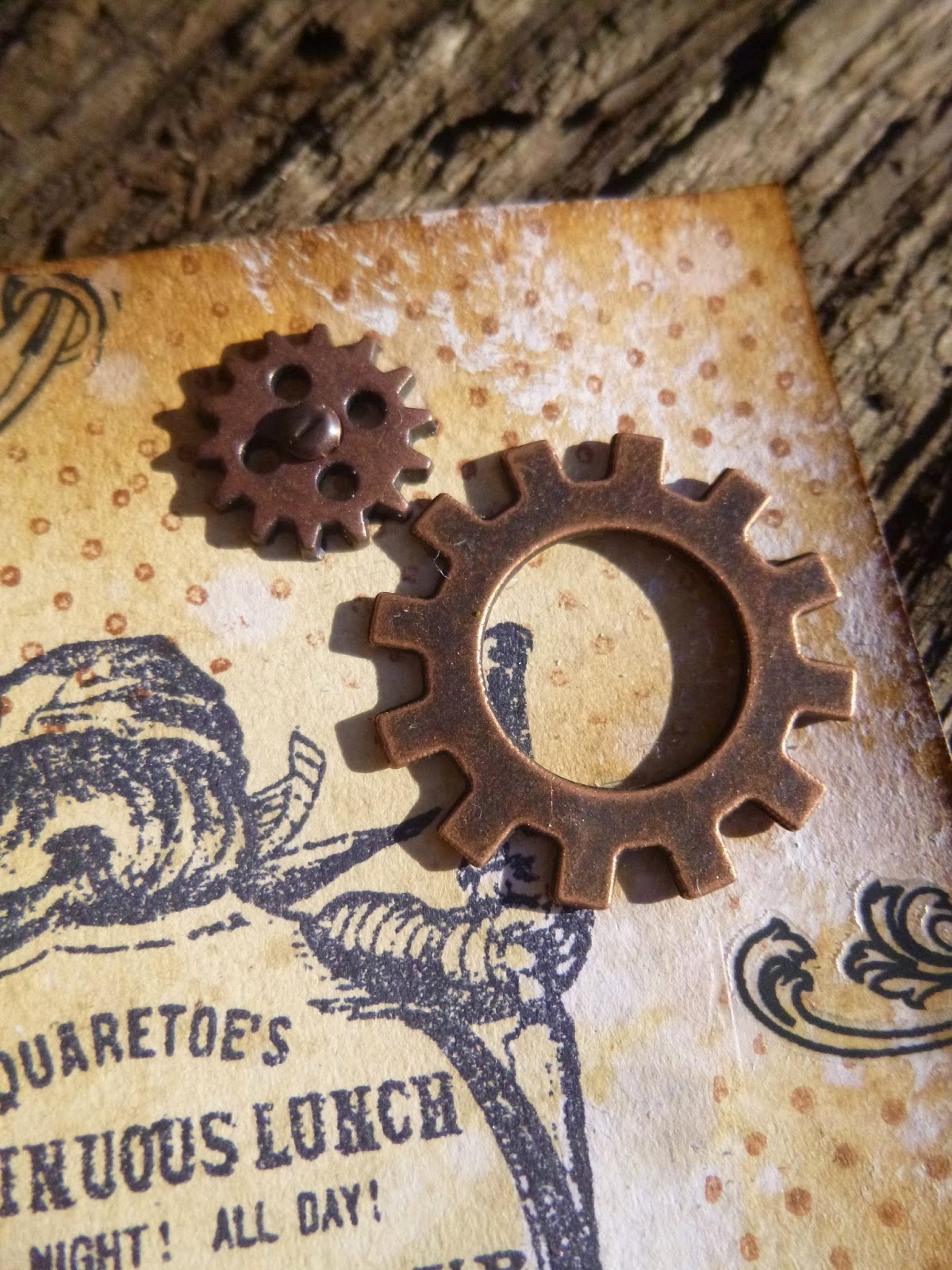
... some gears to keep the digestive system churning for the duration of the Continuous Lunch...
... and Mr Pinchbeck clearly deserves to be labelled Unique with an Idea-ology Muse Token.
So that's my historical advertising trio for you today. Hope you don't get tempted into anything unwise! Mind you, there's still a week to join our In The Garden challenge and while you don't have to use Artistic Stamper stamps to join in, if you do you get two entries into the draw... so you might want to go stamp shopping!! Thanks so much for stopping by, and I'll see you again soon.
Ingredients used:
Artistic Stamper stamps - Phineas Pinchbeck, Squaretoe's Continuous Lunch, Goose Grease, Mini Polka Dot Background
Idea-ology Remnant Rubs Elements
Idea-ology Muse Tokens
Distress Inks - Pumice Stone, Vintage Photo
Perfect Pearls Mist - Heirloom Gold
Gesso
Wednesday, 21 May 2014
A little bird told me...
Hello happy crafters !
This is Titbelsoeur today showing you the very new Neil Walker bird stamps.
When I received them, I decided to make a second tag looking like the first one I made for the May Challenge (do not hesitate to participate in it !) and have kind of a diptych!
So then, here is this new tag :
I made it the same way as the former one : a peeled-off cardboard I covered with Gesso, then I coated with molding paste through my brick wall home-made stencil, let it dry, and added acrylic colors (blue, pink, green and brown. Just like the other birds, I stamped these on to a bristol and colored them with Promarker pens.
I used another "zen" quote from the Journaling Words 3 to counterpart with the first one which was"Carpe Diem" :
thank you so much for
stopping by,
I am looking forward to reading your comments !
A tout bientôt,
Sunday, 18 May 2014
Sewing Card by Alison (Craftytrog)
Hello Stampers! I made a bright, sewing themed card for my post today, I hope you like it.
Here are the ingredients...
Distress Inks - Picked Raspberry & Spiced Marmalade
Archival Inks - Jet Black & Potting Soil
Distress Stain - Spiced Marmalade
Metal Poppers
and, here's how I made my card...
1. Ink the Flowery Lace Border stamp with Spiced Marmalade Distress Ink, & stamp just above the centre of a square white card. Ink the Lacy Border with Picked Raspberry, & stamp underneath the Flowery Lace.
2. Ink the zig zag stitches with Jet Black Archival Ink, & stamp between the laces. Ink the running stitch stamp with Potting Soil, & stamp over the zig zag stitches.
3. Stamp the seamstress on Smoothy White Card, using Jet Black Archival, use the waterbrush & Distress Inks to colour her dress, cut her out, & use glossy accents to glue her to the card, as shown.
4. Stamp some buttons on white card, using the Distress Inks, colour them, cut them out, & glue in place.
5. Colour some seam binding ribbon with Spiced Marmalade Distress Stain, form a bow, add some highlights with the Picked Raspberry Distress Ink, & glue to the card.
6. Glue a few metal poppers to the card, as a finishing touch.
Happy Stamping,
Alison xxx
Friday, 16 May 2014
Welcome to our new Creative Team Members!
Hi!
I am very happy and rather pleased to introduce you to our new team members!
It was one of the hardest things that myself, and the current team members, Alison, Alison, Astrid and Tit, had to do, and that was choose!! Thank you to everyone who applied, the standard of artwork was phenomenal, and from a very wide spectrum, and I am just sorry we couldn't choose everyone!
However choose we did, and I am sure that you will love their creations, when they post next month.
Let me introduce you to the work of Dee Adams, who hails from the UK
These creations are from our second new Team member Maria Potapovich (mellpellmell) who is from Belarus,
Finally all the way from India we have a taster of Shilpa Nagaonkar's work.
This is a truly International team, and, I , for one, am extremely proud to see all the gorgeous work that the team does every month. It is truly innovative and inspiring!
Thank you to everyone, and I am looking forward to next month, when we will see all the new team's creativeness.
Have a very creative weekend
{hugs}
Jennie
I am very happy and rather pleased to introduce you to our new team members!
It was one of the hardest things that myself, and the current team members, Alison, Alison, Astrid and Tit, had to do, and that was choose!! Thank you to everyone who applied, the standard of artwork was phenomenal, and from a very wide spectrum, and I am just sorry we couldn't choose everyone!
However choose we did, and I am sure that you will love their creations, when they post next month.
Let me introduce you to the work of Dee Adams, who hails from the UK
© Dee Adams |
© Dee Adams |
These creations are from our second new Team member Maria Potapovich (mellpellmell) who is from Belarus,
© mellpellmell |
© mellpellmell |
Finally all the way from India we have a taster of Shilpa Nagaonkar's work.
© Shilpa Nagaonkar |
This is a truly International team, and, I , for one, am extremely proud to see all the gorgeous work that the team does every month. It is truly innovative and inspiring!
Thank you to everyone, and I am looking forward to next month, when we will see all the new team's creativeness.
Have a very creative weekend
{hugs}
Jennie
Wednesday, 14 May 2014
Birdsong - Be Proud of Your Song by Sherry Cheever!
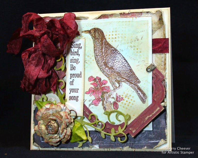
Good morning! Sherry Cheever here with you again and I have a 5.5 square card using Birdsong Elements to share with you today!
The bird image was stamped in Gathered Twigs Distress Ink and embossed with Clear Super Fine Embossing Powder. The image was then watercolored using Distress Markers in Barn Door, Fired Brick, Aged Mahogany, Peeled Paint, Tumbled Glass, Scattered Straw and Frayed Burlap. After water coloring, the image was detailed with an embossing marker and embossed again in clear embossing powder.
After embossing the image a second time, the background was airbrushed with alcohol markers then over-stamped with Mini Backgrounds #1 and Calligraphic Mat 11 using Dandelion and Tree Branch Ranger Archival Inks and Snow Cap Pigment Ink. The image was die cut/embossed with a rectangle die template and while the paper was still in the die, was sponged with Tumbled Glass and Antique Linen Distress Ink.
A frame was made for the image using designer paper that was glued to chipboard and then die cut/embossed with a labels die template.
The sentiment was stamped in Archival Ink and mounted behind the flower with an Idea-ology Fastenings Memo Pin.
The flower, leaves and vines were die cut from coordinating designer papers with a blossoms and foliage die templates. The leaves were colored with Peeled Paint Distress Ink and the edges of the flower were sponged with Antique Linen and Fired Brick Distress Ink.
The ribbon is seam binding dyed with Distress Ink. I found it in my stash, thought it matched the card, but I don’t remember what color it was dyed with. If I had to take a guess, I would say Aged Mahogany.
The designer paper used for the background was distressed using Tonic scissors, sponged with Antique Linen and sewn to a cream colored base, which was then attached to a cream colored card.
That’s all for today; thanks for stopping by and joining me!!
Tuesday, 13 May 2014
Mini Journal for sketching by Astrid
Hello everyone, lovely to have you drop by here! Can you believe the month of May is nearly halfway over already? With the weather turning ever warmer, I sometimes love to do little sketches outside, and needed a little journal that is easy to just pop in your bag or even a large pocket.
I found a template online on Marion Smith's site (so I can't share it but you could check it out if you are interested) and then started to think how I could decorate it with Artistic Stamper stamps. The template itself is for a little wallet type booklet to be used for recipes or similar, but I decided to make it into a little journal instead.
I copied the template onto strong card and then used some Graphics 45 French Country paper to cover the different panels.
Next I stamped one of the stamps from the Architecture 3 set in Sepia Archival ink, cut it out and adhered it to the front of my little journal together with a decorative brad.
The inside was covered with a piece of scrapbook paper from my stash. I then created a little booklet out of Ranger Water Colour Cardstock, as this is so thick I could only fit in one signature, but that is alright, it is only meant to be a little journal.
Below you can hopefully just see how I stitched it straight into the cover.
The flap, which is also the closure was further enhanced by stamping the word Artist Journal from the Classics 1 set by Tim Holtz.
For the back of the little journal I stamped two further images from the Architecture set in sepia, cut them out and adhered them to the cover.
The booklet closes with a little magnet
Once it is filled, it will be easy enough to create another one. Well, hope you like it, I am sure it would be easy to do something very similar with a # 12 manila tag.
I die cut two decorative corners for the front and coloured them with the same ink and of course I also inked around all the edges of the journal as you probably saw.
Thank you for visiting and stay inky!
Subscribe to:
Posts (Atom)