Hello everyone,
Alison here (that's Alison B - for butterfly, or Bomber, or the second Alison on the team after Craftytrog... as you like it). I'm so happy to be here with my first post for Artistic Stamper as a full-blown member of the Design Team. I'm honoured, and very excited, to work alongside these brilliant artists.
In fact, to be honest, I've been having a bit of a wobbly. Everything's been a bit overwhelming recently (in a good way on the crafty front, to be fair, but a bit more difficult in other directions) - and I got in a bit of a spin about this make. In the end - with a couple of discarded "fails" on the desk in front of me, I decided to take it out on a journal page.
I've made tentative inroads into art journalling (I'm very good at buying beautiful journals - always have been, long before I even knew about art journalling or stamping or inks or any of this!), but recently I've been so inspired by some of the amazing journallers around in Craftyblogland, and it seemed a journal was the perfect place to let go of trying too hard, and just follow my instinct. So here it is.
I basically just did lots of stuff I like with lots of stuff I like (links at the foot of the post)... but the whole thing starts from the
Gibson Girls who - to me - have such a strong yet sad presence as images. I already did some playing with that idea in
Journey to Yourself, one of my Guest Design pieces in February.
And here they are doing an excellent job of representing some of the internal disquiet being held in behind an apparently calm exterior.
I gesso'd some pages in my new journal (picked up by my mother in Oxfam - so hardly counts as another purchase!). It's a good solid book, 9.5 x 7 inches, with lovely strong paper, but the gesso still helps when you're planning to load'em up.
While the pages were drying, I stamped the Gibson Girls onto some papers from the Tim Holtz Crowded Attic collection, and cut them out with the ATC die from Sizzix.
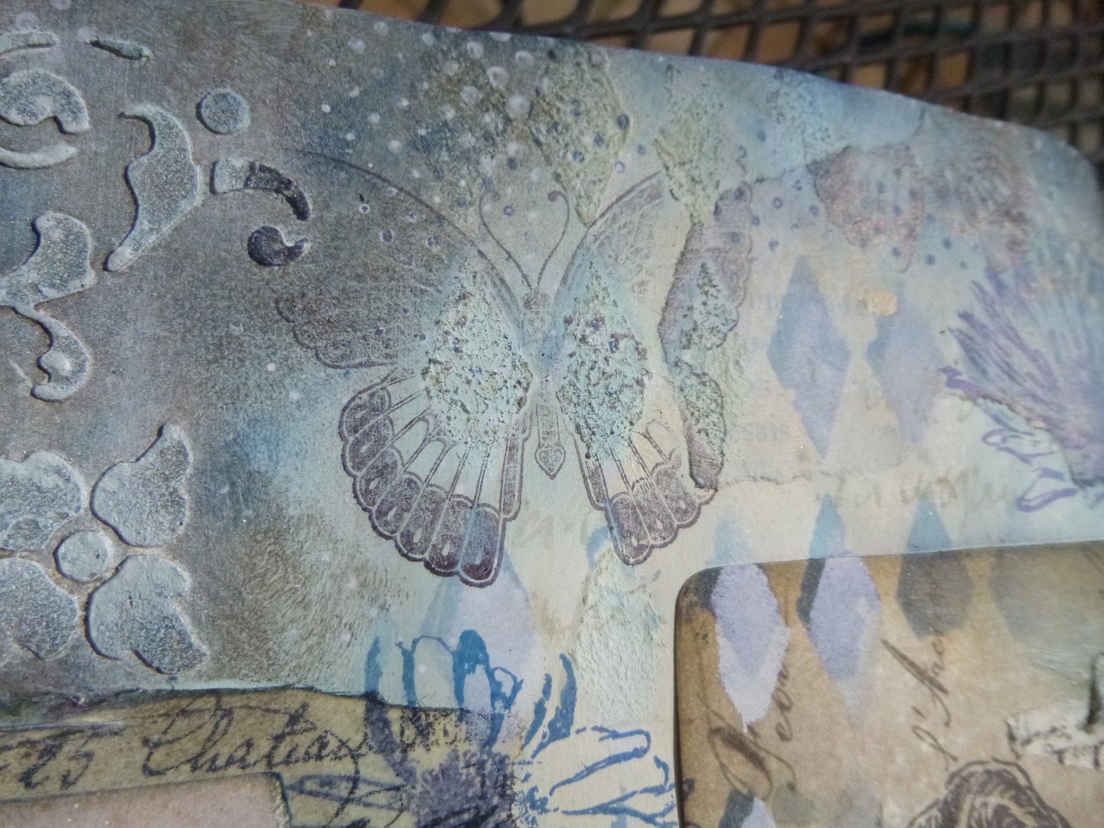
First step for me is always texture - I love playing with texture paste and stencils, and the new Andy Skinner stencils are so great.
Random torn book pages and torn tissue tape create some extra architecture around the pages, and I already pretty much knew by this point where I wanted my women to go.
I did some inking with Pumice Stone, Frayed Burlap, Faded Jeans and Chipped Sapphire, and then decided the ATCs needed to be glued in so that they would start to get "embedded" into the page.
I did some Harlequin stencilling with Chipped Sapphire, then went over some of it in Picket Fence Distress Paint with the stencil slightly shifted for a dimensional effect. I decided I wanted a bit more texture, so I dabbled some gesso through some of the diamonds with a hard bristle brush.
Lots of stamping: beautiful flowers from the
Botanical Plate 1...
... butterflies from
Insects and Butterflies, the delicious little
Calligraphy Mat 19...
Then I had a wonderful time adding the
Mini Polka Dots, first in Cobalt Archival, and then in Picket Fence Distress Paint - love this look!
Time to pay some extra attention to my dimensional Andy Skinner flourishes...
... some more layers of ink and paint, building depth, and finally some dry-brushing to highlight the textural detailing.
I'm a bit in love with Pumice Stone - it gives such a brilliant look of aged stone... predictable, I suppose, given the name!
And then, of course, there's the sentiment. It's from the new Tim Holtz
Way With Words set, and it speaks to me very loudly at the moment, since I'm about to head into some work that demands one of my "other me"s, wearing a different hat, and one that weighs quite heavily.
Can I keep this new creativity alive and bubbling once all those demands start being made on my time and energies (physical, mental and emotional)? I hope so...
It went through several versions - dark ink, pale paper; pale ink, dark paper; dark ink, tissue paper...
but in the end there was something about the paler words that said something more profound about a lighter presence in the world.
So I finished up with Vanilla White embossing powder stamped on some of the reverse sides of the Crowded Attic papers, and then inked of course.
I know that this may seem a slightly downbeat debut, but the good news is that creating this page certainly seems to have been therapeutic - on the crafty side, if nothing else. All sorts of far more cheerful and colourful creations are bubbling up over at
Words and Pictures over the next few days!
Having said that, I really love the pages I've ended up with - it did me good to just let my crafty heart lead the way. I hope it offers you some inspiration (or at least food for thought). If so, come and play along with our
Words challenge this month... love to see you there.
Thank you so much for stopping by today, and I'll see you again soon - hopefully with a shorter post next time!
Here's what I used; click to go straight there:
Artistic Stamper stamps:
Gibson Girls Plate 1,
Botanical Plate 1,
Insects and Butterflies No.1,
Mini Polka Dots,
Mini Calligraphy Mat 19
Stampers Anonymous: Way With Words
Gesso
Texture Paste
Andy Skinner: Baroque
Crafter's Workshop: Mini Harlequin
Idea-ology: Sketchbook Tissue Tape
Distress Ink: Chipped Sapphire, Faded Jeans, Frayed Burlap, Pumice Stone
Archival Ink: Jet Black, Cobalt
Distress Paint: Picket Fence
Wow Embossing Powder: Vanilla White
From my stash: other acrylic paints, book pages, journal