Showing posts with label Labels. Show all posts

Saturday, 7 April 2018

Bees by Titbelsoeur

Hello everyone,
This is a canvas I have first covered with corrugated cardboard, gessoed and painted it. Then added a piece of an old pair of jeans, and a stamped page of a book.
On both sides, I have sticked pieces of a very special masking tape, that you won't find in any shop. Why ? because I have made it on my own, with 2 Artistic Stamper stamps that fit very well to it :


this one from Ephemera 1 A5


and that one from Labels A6


I also could have used stamps from The Open Road 1 A5  but I did not.

I first stamped the book page with the small bee from Honeycomb Background & Free Bees, using a lot of Versa and Izink inks, to have a multicolor background. I stamped the queen and hid her to protect when stamping the honeycomb. .


Here is the finished project :


Do not forget that you can win these fabulous stamps, just participating in our challenge 

BIRDS AND THE BEES


 for 3 chances to win !

Thank you so much for stopping by.
Your comments are very much appreciated here, on my blog
Bye for now and happy creating. 

Titbelsoeur

Friday, 19 June 2015

Hello Mr Postman !

And hello you Happy Crafters !
Since Summer is still on its way, I have made my second project for June to help you participate in the June challenge if you miss inspiration... and at the same time make your postman's day !

Always have 2 or 3 blank envelopes on your craft table to wipe your leftover paint or ink on stencils or stamps.

After using the Marbled 2 Background stamp with Broken China Distress ink, spray it up with water and wipe it on your envelope :

This will create a blurred wavy background. Let it dry.


Then you can stamp the Cogs Background here and there on the edges to leave room for the name and address, with Faded Jeans and Chipped Sapphire  

And stamp the wheel from the Seaside No. 1 # 018 plate with Cobalt Archival


Also you may stamp the tag from the Labels A6 plate just to help write name and address.

The Special Delivery stamp comes from the Carte Postale size A5 © Katy Fox plate
the seashell stamps come from the  Seaside No. 1 # 018 plate

Thanks so much for stopping by,
your comments are very much appreciated.
I hope you will participate in our June challenge
 to win some fabulous Artistic Stamper stamps.

Titbelsoeur

Sunday, 13 October 2013

Thinking of you on Halloween


Hello everyone, this is Astrid here with a little Halloween project, - a tag in two parts:
Now I love Halloween and Halloween projects, but for some reason I don't own many Halloween stamps, so this was a bit of a challenge for me, but hey ho, nothing like being creative with what you have....
These are the stamps and products I used.

Stamps used:
Inspiration Jars
Travel Labels
Grungy Greetings
Katie Fox Leaves
Other products
Tim Holtz Embossing Folder Eiffeltower and French script
Distress Paints: Antique Linen, Weathered Wood, Bundled Sage
Distress Ink: Gathered Twigs, Vintage Linen and Bundled Sage, Rusty Hinge, Wild Honey, Aged Mahogany
Archival Ink: Potting Soil
From my stash
Prima Mixed Media tag
Sizzix Difuser
String
Brown pen
Seam Binding
Graphic 45 Happy Haunting collection
A few embellishments and some seam binding
Hole punch and eyelets

I started by cutting a Prima Mixed media tag from my stash into two parts and then ran the top part through the Tim Holtz script embossing folder with one of the diffusers to give me an un-embossed part in the middle. I then coloured it with my three chosen colours of Distress paints by adding them to my craft sheet and then swiping the tag through it until I was happy with the result. I then added some Gathered Twigs Distress Ink and Archival Ink in Potting Soil around the edges.
Next I stamped one of the jars and one of the labels onto smooth stamping card with Potting Soil Archival Ink, coloured them with my chosen colours of Distress Ink and adhered them together. I tied a bit of string and a tiny label, made with some bits and pieces from my stash around the neck of the stamped jar and then adhered it to the tag.
At this point it looked a bit dull and not very Halloween like somehow. So a little fussy cut witch image from an old Graphics 45 collection came to the rescue. The Artistic stamper does not stock this one, but you can find the fabulous Steampunk Spells one HERE.

For the bottom part of the tag I stamped a sentiment from the new Grungy Greetings set in Potting Soil Archival
Next I punched some holes, set some eyelets and attached the two parts of the tag together with some string as you can see from the photo.

A bit more colour was added by stamping two leaves from the new Katie Fox set in Potting Soil and colouring with Distress Inks. A ribbon and little button finished it all off.


Well hope you like my little Halloween project. And don't forget, if you have not entered our challenge yet, there is still plenty of time to do so!! To see the deets just click HERE

Thank you for visiting and see you next time!

Friday, 13 September 2013

Journal spread Finnabair style

Hello everyone, Astrid here with my first project for September. As some of you know two of my teamies and myself plus 25 or so other people spent a weekend learning from the wonderful Finnabair about two weeks ago. Today I am sharing a journal spread with you that includes some of the techniques we learnt, but created with stamps from the Artistic Stamper.
I started by creating some "ephemera" using  the Ephemera 1 and Labels sets. I inked some scraps of card with Vintage Linen Distress Ink and then stamped my chosen images in a mix of Jet Black, Coffee and Maroon Archival Inks, I then darkened the edges with some Vintage Photo Distress Ink.
Here you can see them al, - at this point I have no idea yet which ones I will use, but I think they look pretty cool together like that.
Next I prepared my pages. I laid 2 pages from my Mixed Media journal side by side and covered them with random strips of paper, ripped canvas and other textural bits.
I used cheap collage glue for this, that's why it is so shiny here and there.
The next step was to cover it all with a  layer of Gesso.
I had a vintage photo that I wanted to use so I played around until I knew where abouts I wanted to place it
After that I started to arrange my ephemera over and around it until I was happy with the composition. At that point I should have taken another photo but forgot.... So I'll talk you through the next stages. I glued my ephemera down over and around my photo which I had trimmed a little first. I added a few embellishments from my stash and then created a home made spray with a mix of Distress Ink re-inkers, I used Aged Mahogany, Victorian Velvet, Black Soot and Dusty Concord, just a few drops of each. I tested it on the way adding a drop here and there until I was happy with the colour. I put it in a mister bottle with a tiny bit of Perfect Pearls Heirloom Gold. I covered the photo with some kitchen roll and a baby wipe and then carefully sprayed over and around it and also in the other corner of my journal spread. The final step was to add some back ground stamping with Jet Black Archival ink. I used the Calligraphic Mat 12 and the Chicken Wire background for that. Here are some close up of the finished pages:
I added some ink rings still by dipping a bottle lid in some black ink. Here you can see the pages after I cut them apart (some of the strips went right across both pages) and after I inked around them still with Walnut Stain Distress Ink.
 The right side page with the photo
 The left hand side, just with an arrangement of the ephemera and some embellishments.
Finally a few more close ups:


Well, that is it. Hope you like this journal spread, I have to say I really enjoyed making it and I still have a few ephemera left for a next project.
Until next time


Tuesday, 13 August 2013

Enjoy the Journey Shabby Chic style...

Hello everyone and thank you for dropping by  today. Astrid here with a little Shabby Chic wall plaque:
These are the stamps and products I used:
Gibson Girls Plate 1
Calligraphic Mat 12
Labels
Tim Holtz Simple Sayings
Distress Inks in Vintage Linen, Victorian Velvet, Tattered Rose,Weathered Wood, Frayed Burlap
Archival Ink Jet Black
Tim Holtz Rock Candy Crackle Paint
Distress Stain in Vintage Photo
And from my stash:
Tim Holtz Baroque Die
Distressed Doily Die
Spellbinders Flower dies
Some Lace
Perfect Pearl pen
Mount board
Titan Buff Acrylic Paint
Treasure Gold in White Fire
Scrapbook papers (Prima)
Grey Charcoal pencil
Sewing machine

I started by cutting a Baroque frame out of mount board ( I bought a huge bag of off cuts from my local frame shop for £5 but have heard some frame shops even give it away for free, well worth checking out) I cut the baroque label die once more out of paper and inked it with my chosen Distress colours. I then stamped some of the labels of the labels set in Weathered Wood to add some more interest to the background.painted the frame with Titan Buff paint and when dry covered it in a fairly thin layer of Rock Candy Crackle paint. I dried it with my heat gun to make it bubble a bit. When it had dried and crackled I swiped the Distress Stain over it (Like Tim describes in his July Tag) and then rubbed some Treasure Gold over the raised bits .
Next I stamped one of the ladies from the Gibson Girls set and paper pieced her by stamping once on smooth card and once on a scrap of Prima paper. I cut them out, coloured her body with tattered Rose,  pieced them together and then adhered them to my baroque label. I drew a little bit of a grey shadow around her for extra depth. The baroque label seems to be made to fit this lady just inside it...
I gave the lady a little necklace by adding a pearl with my pearl pen and drew the little chain.
Next came the background, I cut another bit of 6 x 6" scrapbook paper in matching colours, inked around the edges with Weathered Wood and stamped some more of the labels and the Calligraphic Mat 12 all in Weathered Wood. Then I sewed around the edges and distressed them.
Next I created some ephemera to tuck behind the frame. I stamped some labels again in Weathered Wood on bits of  paper, coloured them with Antique Linen, Weathered Wood and Brushed Corduroy, distressed and crumpled them to make them look old and tucked them in behind the frame.
Next I glued some lace around my backing paper, cut a distressed doily out of white card, glued it on top and then the frame and ephemera on top of that.
The final step was to embellish with some home made flowers and leaves I still had lying around from a previous project, and then mounted all of that on a piece of 8 x 8" mount board.
One of the Tim Holtz simple saying mounted on a small strip of mount board finished it all off.
Well, there you have it. In my mind I can think of all sorts of stories about this lady and why she is kneeling there like this, but this post has become long enough as it is already.....

Hope you like my wall plaque, thank you for visiting and I hope you are having a creative week!

Monday, 22 April 2013

Don't think I eat nothing but sardines....by Titbelsoeur

... I sometimes eat tuna !

But today this is a sardine tin I will show you (one more !)
I must admit I love making things out of sardine tins. It is the exact size to make a mini-album with cards, and the same size as the Collage Art stamps !


I have stamped it on a kraft sheet I glued on the back, then I added some stuff from my stash : a fridge lamp, a big screw, a champagne cap, a washer and a cork. On the top I glued an old cabinet hinge, and a nut under the bottom.

Then I stamped the label on a kraft envelope, stuck a real stamp on it and stamped with Katy Fox's and others from my stash.


I had real fun making this tin for you, and I hope you like it,
Thanks for stopping by, I am really looking forward to reading your comments !

A tout bientôt !


Thursday, 14 February 2013

Journey to Yourself by Alison Bomber

Hello everyone!  Alison (butterfly) here again with my second Guest Designer piece this month. Long Post Warning: get your cup of tea before you start!


Lots of inky fun in making this one, Distress Inks, Perfect Pearls, Distress Stains galore, and gorgeous stamps from several different Artistic Stamper plates, with the main focus on the glorious Gibson Girls.  (All the ingredients are at the foot of the post, with links to take you straight to them.)


Despite all the fun, the project has ended up having a slightly melancholy, or at least contemplative, "story" to it, which wasn't where I'd planned for it to go at all.  But these creations sometimes have a mind of their own it seems.


I've always loved Charles Dana Gibson's drawings of turn of the century American girls, it wasn't until I was stamping and looking in detail at these particular images that I realised that, for me, they also have a definite sadness within them.


I started with the fabulous Vintage Valise die from Tim Holtz, cutting the main body of the suitcase from the Kraft Resist sheet of the world map.  I daubed Distress Stains in various blues along with Picket Fence direct onto my craft map, and swept the kraft resist paper through it until I liked the look of it.

Using the Picket Fence means that the blues keep their colour integrity better than if you use them on kraft by themselves, which can make them look slightly greeny.  The strappings were cut from Kraft-Core, sanded and inked, and I used tiny brads to attach the strap holders (which I used the other way up to get the plain kraft side, inked).


The luggage label comes from the AS Labels plate, and encourages journeys of all kinds: Seek, Question, Explore the outside world, and the inside one.


I wanted to be able to put things "inside" my suitcase, so - having done two virtually identical cases - I had to work out a way of creating a pocket, preferably one stable enough to allow the suitcase to stand up...


Let's hear it for ice lolly sticks (that's popsicles if you're here from across the water) - one of the most useful things to have in any craft stash!  I used two (one cut in half) to form a framework inside the suitcase, glued with Glossy Accents, and left overnight to be sure of a good firm hold.


At this point, I was thinking that I would fill the case with tags depicting a young girl travelling the world, exploring, discovering and generally having a fantastic time.  But, as I said, as I stamped the various images they started to tell me a very different story.  And the voyage became less an actual journey, more a journey of exploration into the girl's inner self.


So there are two sides to each tag... the front, which just shows you the surface, the exterior, and then - when you turn over - the interior questions bubble to the surface, revealing what's going on behind the eyes.  I honestly didn't go looking for any of these phrases; they arose as I was inking each tag - they seemed to come from the girl(s) themselves.


I started with luggage labels which had previously been stained with tea and coffee, which gives them a wonderful vintage feel straight away.  Once the images were stamped, I blended Chipped Sapphire, Stormy Sky, Vintage Photo and Wild Honey Distress Inks onto the tags.  I've been careful to leave at least the faces un-inked by extra colour, so that they stand out at the centre of each tag.


I spritzed and flicked with water after inking, and then finally added some gilding by spritzing Perfect Pearls Mist in Heirloom Gold onto the mat and splodging the tags onto it - again avoiding the faces, so that you'd be able to "read" what's going on inside.


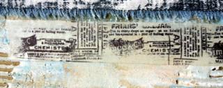
So there's the woman reading her letter...  I stamped her in Coffee Archival both on the tag and on a separate piece of paper so that I could cut a mask. And then I stamped the Calligraphy Mat around her, using Cobalt, to represent the letter she's reading.


I haven't examined the Italian in close detail but in my "story", it's a love letter from an Italian count, approved by the girl's parents as a suitor to her hand.  Everything is tumbling forwards towards the wedding at great speed.


But in the angle of her head and the weight of her shoulders it's clear that for her it's not so clear cut, and so on the opposite side the question reveals itself as she reads his declarations of love.  It's lurking in the corner, in the depths of her mind:  Yes, but do I love him?


The woman with the book - to me it seems like a musical score; she's holding it at exactly the angle to read or sing from as a performer - has a look as though she's hearing something, but is not sure what.  On the reverse, we see that this is not the first time:  Sometimes I wonder... Does no-one hear the same music I hear?


She's masked again, and this time it's music which is floating in her mind. The music stamp isn't the AS one, I'm afraid, but they do have a marvellous music manuscript background so I've popped a link to that at the foot of the page.

The girl with the glorious hair piled high has a look which you could mistake for arrogance or disdain, but when you look again, there's a pain and a defensiveness somewhere at the heart of it... the chin just a little too lifted, the eyelids just a little too hooded, hidden.


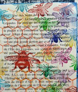
She shares her secrets with us on the reverse, surrounded by flower images from Botanical Plate #1: My beauty is not all there is to me.


The utter dejection and exhaustion is easy to read in the girl resting her head on her hands.  She's probably the one who started me off looking more closely at the others.  Again I cut a mask so that I could stamp the Europe Map Background around her.


I positioned it so that you actually get a slightly removed masking effect - the thoughts hover a little way away from the main image of the thinker.  Her question is clear... in all the travelling, in all the bustle of society events, where does she belong, how does she fit in:  Where is my home?


And finally the wonderful image of the girl seated on the floor, her skirts pooled around her, in a moment's respite from the social whirl of arrival at a new hotel, dining, dancing.  The lovely vintage hotel stamp is again from the Labels plate.


There's such yearning in the angle of her body, leaning forward, listening intently as though to catch the meaning of life, the universe and everything, on the brink of discovery:  Sometimes I can almost understand why.


For the tag trimmings I used Chipped Sapphire and Stormy Sky Distress Stains to tint lots of seam binding, and Vintage Photo and Antique Linen to alter the slightly pinkish tones of some lace from my stash.  I knew these would all be peeking out of the top of the case, so they needed to tone with the suitcase colours too.

Wow... a longer post than ever - sorry!!  I'll have to come up with something very simple for my final project later in the month... two photos max!  Thank you so much for taking the time if you've made it this far, and I hope you've enjoyed the journey.

Alison Bomber
Words and Pictures

Ingredients: Gibson Girls Plate #1Calligraphic Mat #19Europe Map BackgroundMusic BackgroundBotanical Plate #1LabelsVintage Valise dieKraft Resist Paper StashKraft-Core;  Distress Inks: Chipped Sapphire, Stormy Sky, Vintage Photo, Wild HoneyDistress Stains: Antique Linen, Chipped Sapphire, Picket Fence, Stormy Sky, Vintage PhotoArchival Inks: Cobalt, CoffeePerfect Pearls Mist: Heirloom GoldSeam binding;